


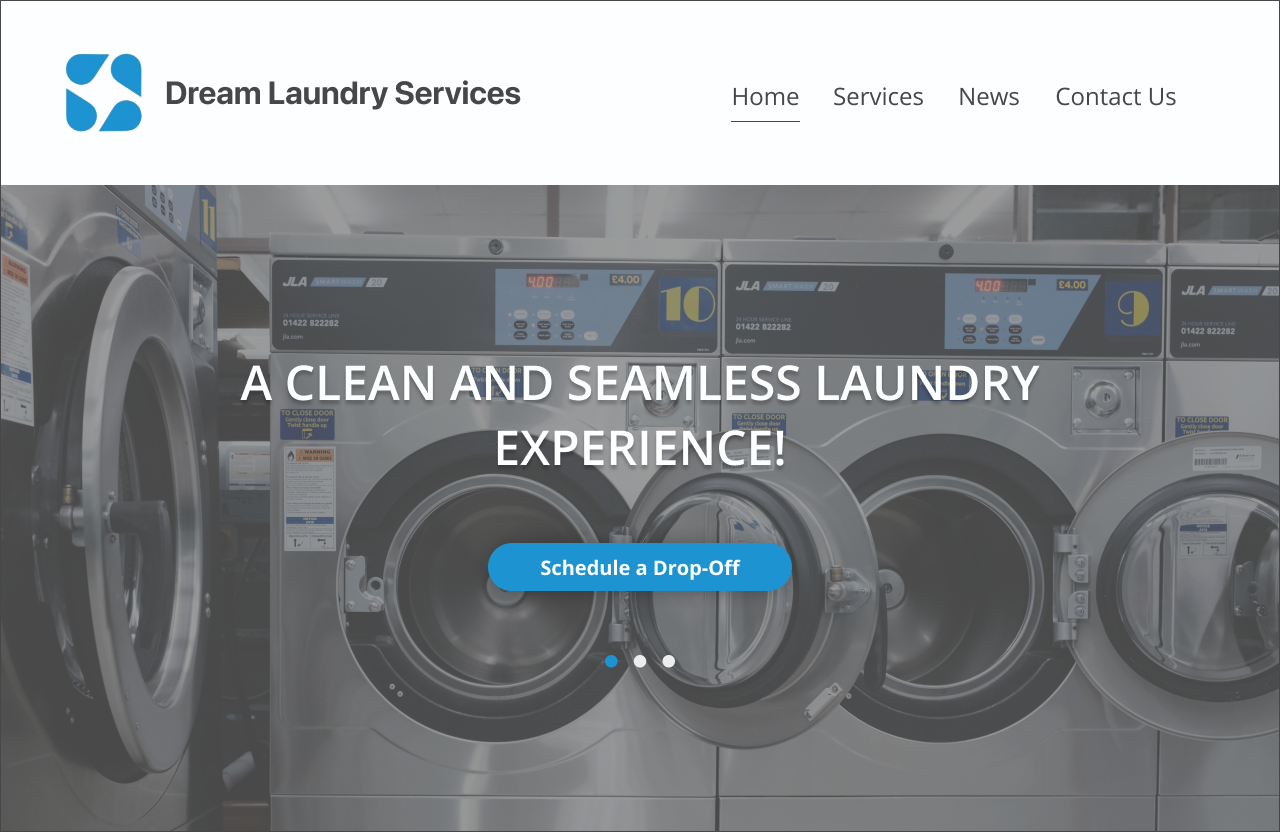
Designing a Scheduling Platform for Dream Laundry Services
Project Overview
Dream Laundry Services (DLS) is an all-encompassing clothing care company with two locations outside Toronto, ON. Throughout a 5 week internship, my two teammates and I worked with the client to create an improved scheduling service.
my roles: UX Research, Project Management
my responsibilities: client briefing, competitive analysis, user interviews, JTBD, ideation workshop, unmoderated usability testing
teammates: Ester Choi, Julie Dang
duration: 5 weeks
type: internship
The Problem
DLS is currently operating with an outdated, inefficient, and cluttered method of scheduling laundry services which reduces customer satisfaction and leads to increased employee stress.
The Objective
DLS requested a way of scheduling appointments that is efficient and organized for both the customer and employees. This will reduce time spent on phone calls and organizing pen and paper notes as well as increase customer satisfaction.
The Solution
A scheduling platform integrated into DLS’s existing website.
The team took information currently collected in the customer appointment scheduling process via phone and turned that into a seamless scheduling flow on DLS’s website. This flow benefits both customers and staff of DLS by saving them time and energy.
Delays from the get-go
The client took 4 days to respond to the team’s email about an initial meeting time, putting us back nearly a week on the project. This was supposed to be a four-week internship with week three falling over a major holiday week. We wanted to get things moving as soon as possible to get user feedback when needed, but initial delays were a major setback.
Dividing the work based on strengths
The team divided the work based on what we predicted we’d need. We knew we would do industry research. With a background in research and business management, I decided to take on the research and user interviews. My other two teammates had backgrounds in art and graphic design fields, so they would take on later design work like wireframing, prototyping, and final designs.
While we wait, let’s look into competitors…
The competitive analysis spanned direct and indirect competitors in the scheduling and laundry industries.
The Indirect
Calendly
Setmore
Acuity
The Direct
Tide Cleaners
Suds
Pride Cleaners
The Unlikely
Uber Eats
From these competitors, we learned that:
The best scheduling platforms have simple, seamless, designs.
Show only necessary information with clear opportunities for the user to view more
The right prompts at the right times

Suds, a local competitor, offers online appointment booking.
An online scheduling platform will put DLS ahead of other industry cleaners.
Suds, a local competitor, has a scheduling platform. However, it is not the cleanest or most visually appealing.
Most industry competitors do not have an online scheduling option.

Calendly’s scheduling flow has clear calls to action. One can clearly check the date and time for which they are scheduling.
Omnichannel presence is the norm.
Continuous engagement builds strong relationships and promotes customer retention.
Service progress checks
Appointment reminders

Pride Cleaners offers similar services to DLS and offers clear descriptions of each on their website.
What do people think?
I talked to ten people with experience scheduling services like haircuts, doctor appointments, car repairs, etc. I found similar trends across the interviews:
Preference for Online Scheduling
Many users prefer scheduling services online rather than making phone calls. Online platforms or apps provide convenience and flexibility, allowing users to schedule appointments at any time, anywhere.
Visualization of Availability
Users appreciated platforms that showed all available time slots visually, allowing them to choose a date and time that works for them. They preferred having a range of dates available rather than being limited to searching by a specific day.
Simplified and Efficient Processes
Users valued scheduling platforms that had a straightforward and easy-to-use interface. They preferred platforms that required minimal information, such as name, email, and phone number, and didn't ask unnecessary questions.
Avoidance of Phone Calls
Users expressed frustrations with having to call and schedule appointments over the phone. They found phone calls to be time-consuming, inefficient, and sometimes challenging to find a private moment to make the call.
Reminder Notifications
Users liked receiving reminders for their appointments, especially through text messages. Reminders helped them stay organized and ensured they didn't forget important appointments.
Integration and Compatibility
Users found it helpful when scheduling platforms were compatible with their mobile devices and had responsive layouts. Integration with other calendars, such as Outlook, was also appreciated.
What will people expect?
To figure this out, I took information from my user interviews to write the following jobs to be done:

These jobs became the building blocks for my team's ideation workshop. I added them to the following KANO analysis chart. Due to the parameters faced in this project, I decided to take a qualitative rather than quantitive approach to filling this out. I drew features from common themes in interviews and industry trends.

Teaching Ideation
Before the ideation workshop, I hosted a meeting to go over what it would entail. I gave my team resources for learning about Crazy 8’s and the JTBD framework.
To introduce the call, we went over the JTBD I had previously written, as well as the KANO analysis. This set the basis for generating “how might we…?” questions. Each team member came up with 2-3 HMW questions and we discussed two to focus on for the workshop. These two questions were:
How might we streamline Dream Laundry Service’s appointment booking process?
How might we save customer information so customers don’t have to re-enter it when using the service again?


Despite having a workshop brief before the actual workshop, there were still hiccups. Hosting a workshop while still teaching teammates how to do these things was taxing and took more time than I had anticipated.
Many ideas
Even with differing levels of ideation experience, we generated many ideas that are user-centered and beneficial for the company.
must-have features
entries for name and phone number/email
the ability to pick from a variety of dates and times
login via verification code to phone or email
text or email appointment confirmations
performance features
a progress bar
the ability to schedule recurring appointments
Initial wireframes bring up more questions
One of my teammates, Ester, worked on wireframes for our product. She designed flows for a returning customer and a new customer.
The company had questions about how users would interact with the platform and in turn, how the company would see these interactions on their side. Although not initially requested, our team wanted to come up with ideas on how DLS’s staff would interact with the scheduling platform.
Our client also had questions about intuitive use. Would customers know to click on a calendar icon to bring up times to schedule? Would customers know to exit the calendar to proceed with the scheduling process?
Her questions helped my teammates and I stay committed to user-centric design, and we were grateful for her feedback.


Jumping to high fidelity designs
As we ran short on time, we decided to make edits based on teammate reviews and company feedback to create high-fidelity designs which we’d test with users.
We tried and tried to host a focus group with company staff. Ultimately, we wanted to benefit them and take some work off their shoulders. Even though our company contact tried multiple times, no one wanted to give their input. We found this strange, however, it was during a holiday period so people were likely busy.
Leveling up
I helped my teammates level up their design skills. We continuously reasoned out design choices in the Figma comments, in messages, in Zoom meetings, etc. I led discussions surrounding color theory and contrast, especially when it came to web accessibility and our users. We tweaked the composition of screens and our flows over and over and over again.
Some aspects could be improved upon. Given more time, I would have recommended my teammate design with a standardized grid layout (8pt) so that the content was consistently organized.

Honoring the time left
I ran unmoderated usability testing through Maze to honor the little time we had left. This pointed out some issues both small and large such as…
Date/Time picker was not intuitive
Users struggled with picking a date and time in a pop-up window. Julie had set it up for users to pick a date on the calendar first, and then pick a time. However, most users clicked on the time first, which makes sense because the date is shown above. It also took users a bit of time to click the “x” in the top left to continue confirming the appointment, which confirmed a previous design suggestion.
Some user feedback:
“The process for booking in not an issue. The test exercise is. I easily selected my timing and then had to sit there thinking it would allow me to conclude. I also had to wait to end task. I didn't have issues other than I could not complete the whole task.”
Users given too many decisions
The heat map of users prompted to sign in as returning customers shows them clicking between returning customer and new customer inputs. My teammate wanted to allow users to sign in as new or returning customers. This didn't prove very clear to the users, as they clicked on both.

A heat map generated during unmoderated usability testing shows users clicking on both returning customer and new customer inputs, even though they were prompted to sign in as returning customers.

This heat map shows many random clicks, likely because users were stuck and did not know how to proceed.
“This was incredibly frustrating. I got far enough in that I could select the initial drop off. I picked January 10th between 9 - 10 am. After that, it did not allow me to go further to schedule monthly drop offs. It just froze.”
“it was fine - sometimes unsure how to proceed to the next page (X vs submit button, etc).”
Making changes based on feedback
Reducing user decisions at sign-in (and elsewhere)
Based on what we found from usability testing and industry research, we made sure the only decision users had to make at first was whether they wanted to continue to scheduling with their phone number or email.
Improving function and intuitive nature of date/time selection
Taking user feedback into account, we changed the date/time picker to include a “confirm date and time” button instead of having users exit out of the scheduler. We also ensured that the prototype allowed users to proceed after selecting the time, even if they hadn’t selected the date on the calendar.

An updated sign-in flow has users, whether they be new or returning customers, enter a phone number or email. If the user is new, they will complete new user inputs. If the user has an account already, they will be sent a verification code. After entering, they will be sent to the scheduling module.

An updated date/time picker allows users to select a time without selecting a date on the calendar first. It also features a CTA button instead of an “x” in the right corner.
We feel that these changes adequately improved the scheduling platform in a way that is accessible and easy to use for DLS’s customers. To make sure the scheduling platform is meeting the needs of customers and staff going forward, it will be important for DLS to continue collecting user feedback as well as keeping an eye on the following metrics.
Key Metrics
Phone Call to Online Scheduling Conversion Rate
This looks at who goes from scheduling one or more appointments via phone call to scheduling two or more appointments through DLS’s website. If people started DLS’s services by making appointments via phone calls and transitioned to using the online platform more than once, it would seem that this is the preferred method. This switch indicates an increase in customer satisfaction with online scheduling.
Average Number of Orders Completed Per Day
If customers convert from phone calls to online scheduling, an increase in the average number of orders completed per day over weeks or months could indicate that online scheduling is alleviating the burden of continuous phone calls by staff. This indicates that both customer satisfaction and employee work improve with the integration of online scheduling.
Customer Retention
DLS can take their number of customers, let’s say a year after launching online scheduling, subtract new customers in that time, and divide by the number of customers they had on the day they launched online scheduling. DLS would want this number to be high, and may only want to include customers who have scheduled 2+ appointments within the year.
Lessons Learned
Working with a remote team requires setting strong communication standards.
Having never worked with my teammates before this project, we had to set, adjust, and commit to our team’s communication standards. I am used to the “respond in 24 hrs or less” rule from working in professional settings, whereas my teammates were not. We talked about realistic expectations for response time and any days/times that we wouldn’t be able to reach each other. We communicated through Skype so we could message each other, send files, and hold calls/video chats all through the same platform. As the team lead, I sent out meeting reminders, and agendas, and engaged in check-ins with teammates a few times each week. The first week or two was rocky, but I’m sure if this team were to work together again, we’d hit the ground running due to the strong communication habits we formed together.
Client work, especially around the holidays, can be unpredictable. You learn to do what you can.
Through the many setbacks of this project, I found many ways to get research and user insights, even if it meant going to the second or third option to obtain what I needed. I would have loved to gather insights from actual customers and employees of DLS to make the best possible scheduling platform for both, but after we sent an email to employees, our company contact individually reached out to coworkers/customers, and put a link up on social media, we did not receive any direct user participation. We made use of the little time we had left to do unmoderated usability testing with a targeted demographic to match that of DLS. I hope to hear user feedback from the company when they implement our designs in the future.
Overall, I am proud of the work that I and my team did for DLS’s scheduling endeavors. I believe it will increase customer retention and satisfaction and increase staff productivity due to saved time.